Product teams and marketers usually face a binary choice regarding visual assets: pay thousands for a custom illustrator to build a proprietary brand language, or settle for a "Frankenstein" UI cobbled together from disparate stock libraries.
Most startups and lean agencies ask the same central question: can an off-the-shelf library actually support a coherent brand system? Or are you doomed to look like a template until you raise Series A funding?
Ouch! by Icons8 approaches this problem differently. It positions itself not as a bucket of random images, but as a collection of distinct artistic "styles." You don't just search for "business meeting" and get twelve different drawing techniques. You select a style-say, "Surrealism" or "Simple Line"-and find coverage for every concept within that single aesthetic.

The Architecture of Consistency
Platforms like Freepik or Shutterstock fail on continuity. You might find a perfect hero image. But when you need a matching icon for a 404 page or a checkout success screen, the trail goes cold.
Ouch tackles this by organizing its 101+ illustration styles into comprehensive sets. The library currently houses over 28,000 business illustrations and 23,000 technology illustrations. The goal is to cover the entire user experience flow. Pick a specific 3D style for your landing page, and you will find matching assets for the login screen, the empty state in the dashboard, and the error messages.
This shifts the workflow. You aren't hunting for a good image. You are selecting a visual language.
Scenario 1: The SaaS UI Overhaul
Picture a small team redesigning a fintech dashboard. They lack the budget for a full-time illustrator, but the interface feels clinical. They need to inject personality without distracting from the data.
The lead designer browses the Ouch library and filters for "Business" and "Technology." They bypass the loud, colorful styles. Instead, they settle on a minimal, monochrome vector style that matches their existing typography.
The Workflow:
1. Gap Analysis: The designer identifies key friction points: the empty "no transactions yet" state, the "account verification pending" screen, and the "server error" notification.
2. Asset Selection: Instead of downloading pre-made scenes that don't quite fit, they search for specific objects within their chosen style. Since Ouch graphics are layered vectors, the designer isn't stuck with a static JPEG.
3. Modification: Using the paid plan, they download the SVG files and open them in Figma. The "account verification" illustration features a character holding a generic document. The designer swaps that document for a credit card graphic found in the same style pack.
4. Implementation: Assets are exported. Because the style is consistent, the app looks like it was designed by a single hand.
Scenario 2: The Content Marketing Engine
Marketing teams move faster than design teams can support. A social media manager needs to push out three posts a week plus a newsletter. Asking the product designer for assets every time creates a bottleneck.
The Workflow:
1. Style Guide Adherence: The brand uses a specific palette of teal and coral. The manager selects a trendy, flat illustration style from Ouch that fits the company’s tone.
2. Rapid Customization: Don't bug the design team. The manager uses the Mega Creator integration. This online editor lets them take a standard illustration and recolor it to the exact brand hex codes.
3. Composition: The post is about remote work. The manager combines a "person sitting at desk" element with a "laptop" element from the same library, rearranging them to fit an Instagram Story.
4. Export: They export a high-res PNG. The newsletter gets a visual break, the social feed remains active, and brand colors are respected. No Jira tickets required.
A Narrative: 20 Minutes Before the Pitch
Rian sits at a desk with a pitch deck due in 30 minutes. The slides are solid. But the "Market Opportunity" slide is a wall of text that will put investors to sleep. It needs a visual anchor.
Rian opens the Pichon desktop app (which houses the Ouch library locally). Searching for "growth," Rian finds a 3D chart element. It’s good, but static. The presentation needs energy.
Switching filters to "Animated," Rian finds a Lottie file of a rocket launching that matches the 3D aesthetic of the previous slides. Rian downloads the JSON file for the engineering team’s web implementation and grabs a GIF version for the Keynote deck.
One catch: the rocket is red. The client’s competitor is red.
Rian quickly opens the asset in the web editor, shifts the hue to blue, and drags the updated file directly onto the slide canvas. The slide is saved with five minutes to spare.
Comparing the Alternatives
When evaluating Ouch, view it against the usual suspects in the asset space.
Ouch vs. unDraw
unDraw is the open-source darling of the developer world. It is free and easy. But because it is so ubiquitous, using it signals "bootstrapped startup" immediately. Ouch offers significantly more stylistic variety (101+ styles vs. unDraw’s single aesthetic), creating differentiation.
Ouch vs. Freepik
Freepik has volume, but it lacks the "system" approach. You download files from thousands of different contributors. Finding a matching set for a full app flow is nearly impossible. Ouch is curated by Icons8. If you commit to a style, you have depth in that style.
Ouch vs. Custom Illustration
Custom work is the gold standard. It offers full IP ownership and metaphors tailored exactly to your product. But it is slow and expensive. Ouch serves as the bridge: it provides the "custom look" through high-quality, consistent styles, but at a subscription price point and instant availability.
Limitations and When to Look Elsewhere
Ouch bridges the gap effectively, but it isn't a magic bullet for every scenario.
• Niche Metaphors: If your product requires highly specific visual metaphors-like a complex diagram of a proprietary chemical process-you won't find it here. You might find pieces to build it, but it won't be ready-made.
• Ubiquity: While better than unDraw, popular styles on Ouch are public. You might see "your" brand illustrations on a competitor's blog.
• Attribution: The free tier is generous but requires a link back to Icons8. For professional corporate sites, this is often a dealbreaker, forcing an upgrade to the paid plan.
Workflow Tips for Power Users
Use the Object Search
Don't just search for scenes. Ouch breaks graphics down into tagged objects. If you are building a service marketplace and need cleaning clipart to represent a janitorial category, search for the specific tools or characters rather than a generic "cleaning" scene. Combine these isolated objects to create a scene that doesn't exist in the library.
Use the 3D Formats for Motion
Working in After Effects or doing 3D work? Look for the styles that offer .MOV or FBX formats. The 3D collection is growing (currently 44 styles). Having the actual model (FBX) lets you adjust rotation and lighting that 2D PNGs can never achieve.
Don't Ignore the "Free" Filter
Prototyping a personal project? Use the filter to isolate free styles. You can download these in PNG format. It’s a great way to validate a visual direction before committing to a paid plan for the SVG or high-res files.
Check the Animation Support
File size matters for mobile apps. Check if your chosen style supports Lottie (JSON) or Rive. These vector animations are tiny compared to GIFs and scale perfectly on retina screens. They are ideal for onboarding flows or success states.
Ouch effectively challenges the notion that you need a five-figure budget to have a brand illustration system. By focusing on consistent styles and covering the unglamorous parts of UI (like error states) alongside the marketing hero images, it provides a toolkit that helps small teams punch above their weight class visually.
It won't replace a dedicated illustrator for unique IP. But for the 90% of UI and marketing tasks that need to look professional and cohesive, it is a formidable resource.
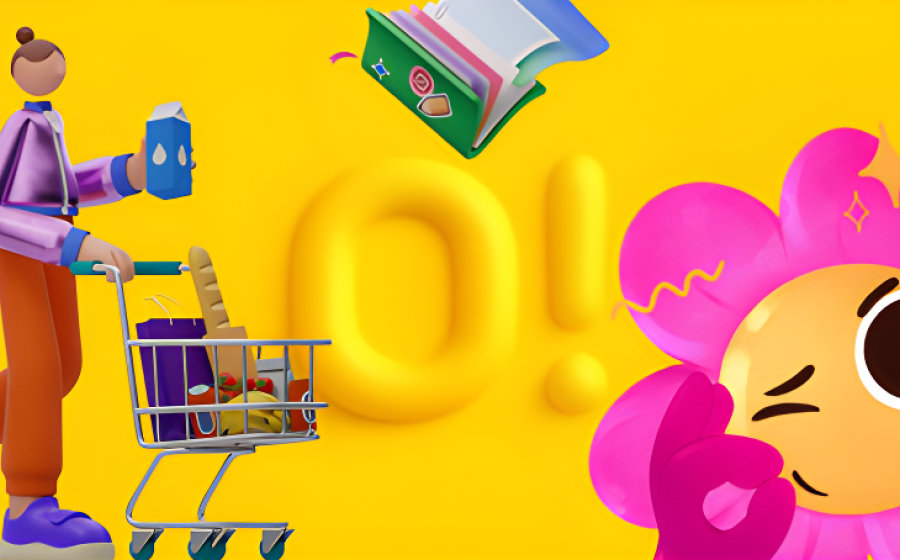
Photo copyright Icons8, published with permission